Did you go to the editorial office?
Back in 1989, I would have to go to the editorial office because there was no other way to read the article. But for the first drawing I did, I didn’t have the article, they just gave me the topic by phone. I was having dinner with my family when the phone rang. A man I didn’t know said he was the head of the Comment section at The Guardian and asked if I could make a drawing for the next day for Francis Fukuyama’s article about the end of history. I’d read various things about his theories before, so I said I’d love to. After supper, I sat down and started sketching, and the next morning I took the finished drawing to the editorial office.
Is that how you first met Alan Rusbridger?
Yes, that was when I first met Alan, his deputies and other associates. He thanked me for the drawing and said he’d be in touch. About a week later, he called and asked if I could come and do drawings in the editorial office. I said of course, and he asked if I could come the next day. I turned up and they showed me to an empty desk. There wasn’t even an article yet, just a short note on what it would be about. I always do two or three sketches because I’m often unsure which idea will be the best. They chose the sketch and I did the drawing at the editorial office. After six months, or maybe a year, I was assigned a permanent spot where I could draw. Those were very interesting times — there were no computers then, no faxes, and texts commissioned from abroad came in by phone. There were lots of secretaries who wore headphones and transcribed articles that people dictated to them.
Where did Rusbridger get your phone number?
I don’t know. He said he couldn’t remember who recommended me. I suspect it must have been someone from the New Statesman, where I’d been published a lot. Rusbridger told us that when he took over as head of political commentary at The Guardian, he decided to illustrate them with drawings, not photographs. And when I started working with the paper, I think I was the only illustrator there. There was another illustrator who worked with the paper — Peter Clarke. He did some photo collages, some caricatures of faces. But generally, there were only photos on the page, and with time, they were gradually replaced by my drawings.
At the beginning, you went there once a week?
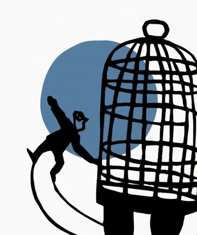
Sometimes once, sometimes twice a week. There would also be long breaks. I’d wait impatiently for them to commission a drawing again because of course there was an ambition already growing within me. There wasn’t a lot of money in it, no newspaper paid really well for drawings, so to make a living from it, I would have had to be published a lot. I think I published about a hundred drawings in the first two years I worked for The Guardian. And then it turned out that other sections also started coming to me with commissions. The first was the section dedicated to social and labour issues in the UK. On Thursdays, there was a Books section. There was also a Health section, and Education was very important. I think other than the political comments section, that’s where I was published the most. Over time, as the newspaper grew, I also got to do covers. There was also a Culture section, Finance, Nature — I drew a lot for them too. I did drawings about pollution, about the destruction of the environment, how to save it, how to save the world. For a while, a constant element of my drawings was a globe that I turned into a person — just a head — and something always happening around it. When Rusbridger became Peter Preston’s deputy editor-in-chief, he asked me if I could change my style as other illustrators had started to imitate me.
Did he mean the stylistic aspect, or the content?
We’re talking about the stylistic side. When the large amount of political commentary was moved into the middle of the newspaper, where there had normally been news before, they needed something to catch the reader’s eye. Of course when the suggestion came up, I was surprised that, since I drew so well and everyone was delighted, they suddenly asked me to change my style. Horrible, right? But I said I’d give it a try. I did some test drawings where instead of a large number of lines and shading, I started to use a brush and filled the spaces between the lines with black ink. I think it was a great editorial suggestion because that’s how I started to do something new, and that helped me a lot, not just the paper. My collaboration with them went even further — after a few months, I was published on various pages of the paper and they started asking me to draw either in the old or the new style.
What year was that?
1993. About three years after I started working with them. In 1992, there was a big article about my work for The Guardian.
An article about an illustrator?
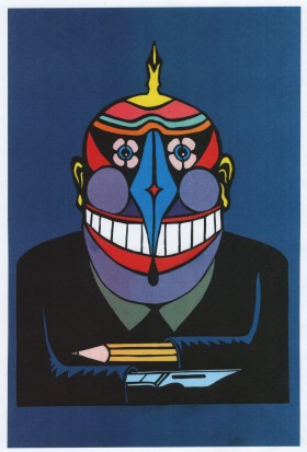
Yes, about me and my drawings. They devoted a whole page to my work and illustrated it with drawings from an unpublished series, Mr Pen. That was how I was officially introduced to readers of The Guardian as Mr Pen. There were a few journalists who, when they made their debut in The Guardian, wanted to have a drawing of mine with their text.
Was there a women’s supplement?
Yes, and it was very important. The Guardian was probably the first paper to introduce a section like that. It was written mainly by women, but also edited by women. It was an important new trend and excellent women journalists came out of it. You could say they spread out from The Guardian to other papers, who started to imitate The Guardian by introducing their own women’s sections. I remember when The Times made the decision, I was still working with them from time to time. There were also sections on books. That was something new, too, and I remember that it grew more popular, too.
We’re talking about the first ten years of your collaboration — until 1999.
I think it was the end of 1999 when colour first started appearing on the pages. There was a great change in technology at the time. When I was starting out, there was a so-called preparation room in the basement of The Guardian, where the typesetters worked, and the whole paper was really made in a very old-fashioned style. In 1989, every page was laid out by hand, and every illustration or photo was photographed and transferred to film. The editors accepted the finished pages and only then were they taken by car to the printer’s. If anyone was late by 7 p.m. — be it a writer or an illustrator — there were worries whether the paper would be published on time because everything took much longer than it does now. I don’t remember exactly when the first fax and the first computer came in. It sped up the work, but the people working at the paper also changed.
Who had the first computer? What was it used for?
It was used in the production of the paper. It wasn’t a top of the line machine, but for those times, it was excellent. These first computers were large and awkward. But then there were better ones, and there were more and more of them. Their introduction meant that the typists — the women who were part of the editorial office — disappeared. People who copyread the paper — who corrected the errors — also disappeared, because that became part of the page editor’s duties.
And revisions?
There were a lot of proofreaders working there and I remember a situation where one day a decision was made to let more than ten people go. Someone even tried to organise a strike. People who had worked at The Guardian for twenty, thirty years suddenly lost their jobs. But alas, new technology had arrived.
Did you have your own desk at the editorial office then, or did you sit at different ones?
At first, I sat wherever there was room. They knew from the start that I drew quickly, so I could sit anywhere, and by the time the editor came back, I’d definitely be done. Later on, I was assigned my own desk. I say my own, but there were other illustrators working at the desk too — on days when I wasn’t there.
You mean it was an illustrators’ desk?
Yes. That was probably the best time for illustrators. The Guardian was famous for having the most illustrators who had desks assigned to them. Steve Bell had a desk, David Austin, Nicola Jennings . . .
Was Peter Till drawing then, too, or not yet?
I don’t think Peter was drawing yet. And when he was, it was never at the paper. He was famous for demanding that the articles be sent to him by motorcycle, and he sent the finished drawings back the same way. There were rows because he refused to make sketches and didn’t want to show anyone what he was going to draw, so his drawings were rejected a few times. But the technology was changing. I had a fax in my studio, so towards the end of this decade of working for The Guardian, I started sending sketches by fax.
What did the fax help with?
When we went on holiday to Italy, I didn’t have to interrupt my collaboration with the paper, and I sent a drawing from the office in Forte dei Marmi, which appeared in the paper in black and white, reprinted from a fax. The quality of the printout from the fax meant that sometimes someone had to fill in the blacks. Once I sent a black and white drawing and got a call that they’d just started introducing colour. This was in the late 90s. ‘Andrzej, we have colour on the page, what should we do with the colour?’ I asked if there was an illustrator at the paper then. ‘Nicola is here.’ So I asked Nicola if she could colour in the faxed drawing.
Did you tell her what colours to use?
No. I told her to choose. These were small drawings because initially only drawings and supplements were printed in colour.
There were also situations where you told the editor what colour to use in the background or in some part of the drawing.
This was before full colour appeared. It turned out that the Saturday editions had extra colour. Especially the front page. I would do it like we used to, like they taught us at the Academy: you make a drawing, and then you outline it, you paint it black and make a note that the black part is to be in colour — green or whatever.
And this was flat colour?
Yes, of course, we’re talking about flat colour, no halftones. It was just about a smooth surface. But then we started making normal colour drawings.
When was that?
In the early 2000s. There were still limitations: if there was to be a colour illustration, the drawing had to be made half an hour earlier because the printers needed more time for it.
When did you get your first computer?
In 1998.
What did you use it for?
I just scanned drawings, as I still do. Except that at the beginning, I used it mainly to keep in touch with the editor and to read articles. In 2002/2003, I would still go to the editorial office, but I also sometimes sent drawings using the computer because I had so many commissions besides The Guardian, and drawing on site at the office unfortunately took too much time. If I came in at 2 p.m. or even earlier, I could never leave before 6 p.m. At that time, I was practically shackled to the paper and my editors. For example, I would have to wait two hours for an article. Of course, it wasn’t a complete waste of time, but when I had to make two or three drawings for other newspapers, I couldn’t do it at The Guardian. And that’s when I gave up my desk and told them I would do everything from my studio.
Had others done so earlier?
Yes, much earlier. Steve Bell, who came to the newsroom from Brighton, was probably the first. And I couldn’t keep up with making other drawings, so sitting in the newsroom affected me badly. It also depended on which editor was working that day. When Alan Rusbridger was still there, he and his co-workers were always impeccably prepared. I realised that it all depends on the people. I had five or six different editors for the political commentary page. And that’s what surprised me — the difference in the level of professionalism.
I remember that in 2008, everything started to fall apart.
As a result of the financial crisis, the small magazines folded first. I remember Accountancy Age, a publication for accountants. It was the first signal of some sadness. Perhaps I didn’t feel it, because I had so many commissions every day that when a magazine suddenly stopped publishing, I could only say ‘Oof, that’s one less drawing to do.’ However, I was greatly saddened to hear about The Bookseller folding — its paper edition was shut down because circulation had dropped and there were no advertisements. In 2005, The Guardian reduced its dimensions to the Berliner format, and when the new layout was made, it turned out they no longer needed so many illustrations every week.
Was this a period when many illustrators lost their jobs at The Guardian? I remember you were one of the very few, perhaps even the only one besides Bell, who was left over from the old guard?
In the end, there were two of us left. And not just because the number of illustrations had dropped, but their size became limited too, they got smaller. Besides, Bell does satirical drawings — that’s a bit different, his drawings appear as a satirical column.
When The Guardian let most of their illustrators go, did they start putting in photographs instead, since there had to be some visual material?
Yes, or instead of an illustration, there would be a green square. A different layout of the paper started to take shape. After all, you had to pay for the photograph too. It wasn’t just illustrators who lost their jobs, but also photographers. The Guardian employed six or seven full-time photographers, and at one point it turned out the paper was using the same pictures as The Times or the Daily Telegraph — from an agency.
Development over ten years is so colossal that we live in a completely different world now.
The changes have been incredible. The circulation of dailies and weeklies has declined because you can find most news online. I used to buy one or two papers every day. Now, by the end of the day, I can find everything on the Internet, so when I go to buy the paper the next day, it turns out that I read most of the news the day before.
The online edition of The Guardian wins awards for various aspects of journalism in almost every department.
They supposedly have the largest online circulation in the world — the highest number of clicks per day. The Guardian wins most of the awards, but these are prestigious awards with no impact on the paper edition’s circulation, and they guarantee nothing when it comes to the online edition.
The greatest crisis in your collaboration with The Guardian happened in the last year, didn’t it?
No. It was actually the last few years. First, all illustrations for supplements were dropped. Then others, to reduce the cost of pages. Every editor in charge of a page had, and probably does to this day, a budget they had to fit into.
What was it like in your case?
First I lost all the illustrations in the supplements, so I was drawing probably only three times a week. That suited me quite well and it was enough in terms of artistic fulfilment and earnings. I had two drawings in the big paper and illustrations for Catherine Bennett’s article every Wednesday. Then I lost the Bennett column illustrations, and that left me with two drawings a week. But then they changed the format, so these illustrations were not that impressive anymore. And on top of that, colour had been added. Frankly, I don’t like colour in press illustrations. But I’ve accepted it. At that point, I lost interest in drawing as a whole; it no longer seemed as attractive as it did before. The drawings became smaller. One time, someone called me and said, ‘We need to limit your contributions to one drawing a week.’ I then wrote a letter to Rusbridger to say that I was losing a lot of money because of this, that it was a surprise for me, that no one had told me this could happen. As a result, I got to draw two pieces a week for another year or two. But when things got so hard at the paper that my art editor wasn’t there anymore, someone from the paper wrote to me that at some point in the future, they would only need one of my drawings a week. And a few years later, someone told me that I couldn’t even have one drawing a week.
You’ve only been drawing every other week since this year?
Last year, a new section was created, ‘Europe Now’, which comes out every two weeks. Its editor said that she wanted me to make large drawings, which made me happy because this format resembles the formats from my earliest collaboration with The Guardian — there is enough room to actually draw something.
Nearly the whole page.
Indeed. A truly big drawing, which rarely happens in newspapers these days. That was one drawing, and another for the commentary. One day, they told me that they were doing away with the commentary page drawings and from the first of January this year, I would only have an illustration every other week, for the European section. But I have to add something here that I find interesting. I don’t know if it’s related to my age or all the years I’ve been working with The Guardian: I didn’t feel like they were giving up on me. I even felt a kind of relief, because these two drawings a week for the last four or five years were no longer giving me any satisfaction. The subjects have not changed — they tend to repeat, especially on the political commentary page. Even for the illustrator, it all starts to be predictable at some point. I can say that at times I react like Pavlov’s dog to a light being turned on — I start salivating, or rather my pen is ready to draw as soon as I hear the first word being spoken. But the people have changed. They’re often unable to make a decision about the sketch I send them, so they try to choose the most neutral sketch that has nothing in it.
You make sketches with nothing in them?
No, I make sketches that always have something going on and I want them to convey a message to the reader. My commentaries often get remarks from the editors, before I even start drawing — they want to make sure my pieces aren’t negative. Looking through my drawings in connection with the exhibition at Zachęta, I’m almost a hundred percent convinced that the ones from my first ten years couldn’t be published now. And not necessarily because of political correctness, but because of their aggressive power of expression in general. Today I found a folder of old drawings, which were printed many years ago — what ideas I had! But it’s not that I don’t have ideas now, just that I wouldn’t send in a sketch like that now because I know what the reaction would be.
There’s an opinion — I didn’t come up with it myself — that you changed the face of press illustration in the UK. Did you know that?
I did. Maybe at first, when I started drawing for English papers, I wasn’t aware of that. But after a year or two, when many imitators of my drawing style had appeared, I realised that I really did have an influence on the type of drawing commentary in newspapers. People started to think differently about it. Drawings in the English press were based on caricature, or on very blunt, full-on illustrations. I, on the other hand, not knowing the language, couldn’t continue — and didn’t want to — using the style I’d practised in Poland: commenting on political events by means of jokes or philosophical metaphors using the text.
The drawings you made in Poland were largely based on the text.
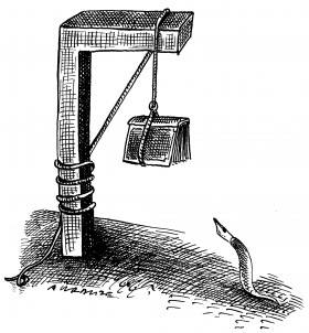
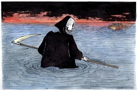
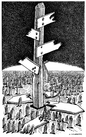
Of course, the drawing was about the text in general. Here in the UK, I faced a difficult situation — how to comment, whether I would at all be able to comment on political and social matters without using language. And so I drew on what I knew from art history — 19th-century illustrators like Grandville, Doré, and of course the great Goya, whose drawings themselves were very bold. I knew that a drawing should tell a story, catch the reader’s eye with a single image and tell them something, add something to the text the illustration was published with. And I have to tell you, it worked very well. That’s how I see it now, when I look at old drawings from thirty years ago. I see their boldness, their clarity. Although times have changed, you can figure out what they’re about without much effort.
Someone once asked you where you got your ideas, what the process of making these drawings was. You said it was a matter of practise.
In response to a key phrase or a text, I get an image in my head. It has to happen immediately, but it’s a matter of practise, always drawing, constantly referencing symbols, signs, which I translate onto paper. They come to me automatically: how to show sadness, joy, power, how to show it visually.
How is it possible to present abstract concepts in a drawing?
I do it automatically, many times without thinking. If I wanted to explain, I would have to pick up a specific drawing and remember how it came about.
This path is so short that it is difficult to trace.
But it is possible, once the drawing is on paper.
London, September 2019
compiled by Marta Miś
